One of the things I love most about indy publishing is the ability to change my mind.
Want to tweak the blurb on the book’s Amazon or Goodreads page? Go for it. Need to fix a typo spotted by an eagle-eyed reader? Done. And the biggie of them all: Want to change your books cover? Make it so!
And that is exactly what I have done for my Battle of the Blocks adventure series set in Minecraft. Read on to find out why and to see the new cover.
Cover 1: Good in Theory but . . .
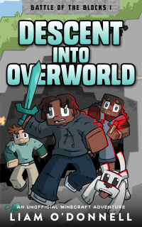
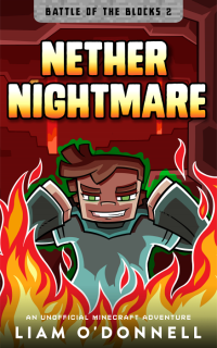
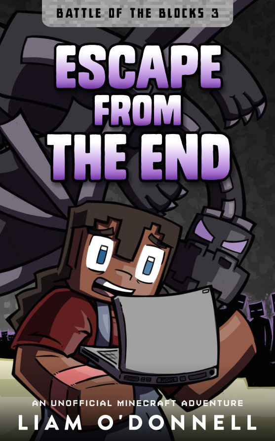
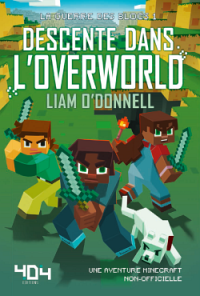
The Battle of the Blocks series is a trilogy with each book featuring a different land in Minecraft. I wanted each book’s cover to reflect the signature block that makes up that land. Book 1, Descent into Overworld, takes place in Overworld the land of grass and stone. So, the cover featured a grass block background. Book 2, Nether Nightmare, would feature a block from the Nether and book 3, Escape from the End, would feature a block of End Stone.
Here’s the cover of book 1:
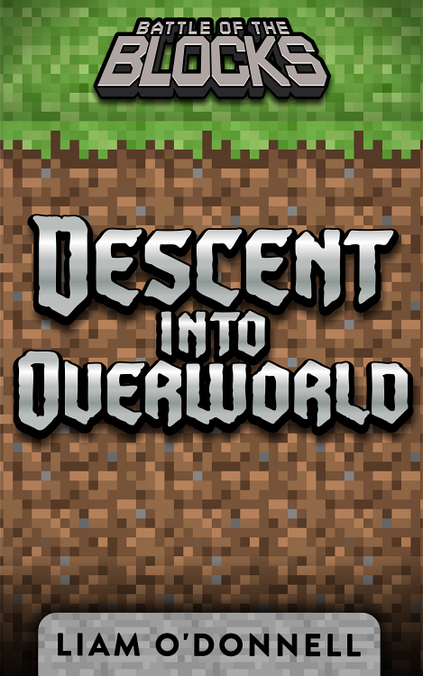
The first cover. Not bad but an idea that just didn’t work.
All great in theory but not so great in execution. While my cover designer did an amazing job creating the cover to my specs, it just didn’t look the way I thought it would.
It didn’t say “kids book” and it didn’t fit with the growing number of other Minecraft kids books appearing online. If I was a kid, that cover wouldn’t grab me.
I lived with the grass block cover while I wrote book 2, but I knew early on that I would be changing things up when book 2 was nearly complete. And that time is now.
Cover 2: Now We’re Talking!
For the second version of the covers, I knew I needed the characters front and centre. To do that, I was going to need original art. And that meant hiring an artist. A first for me, but very exciting. This is where I take off my writer’s hat and put on my publisher’s chapeau and hunt for illustrators.
I turned to the hugely popular Minecraft 2014 calendar for inspiration on what a scene in Minecraft could look like when you take that blocky look just a little bit further.
My search led me to ScribbleLiz, who posts some great Minecraft art on her DeviantArt page. I contact Liz and we worked out some concepts for the books. I was thrilled when she sent me sketches and rough illustrations that brought the characters to life.
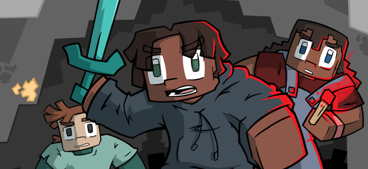
After a few short weeks, Liz sent me the final illustration for the book and I couldn’t be happier. And here it is:
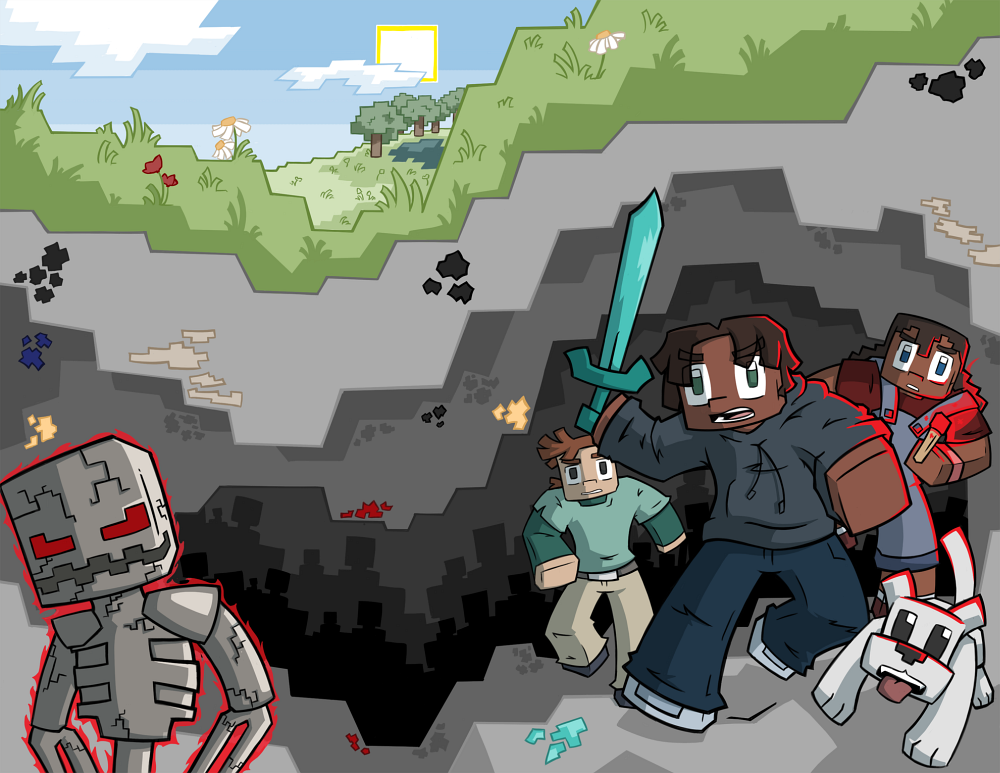
The new and improved cover illustration. Lots of action and energy. Hamid, Jaina, Ant and Bones all charging into battle, with Slashax, a baddie looking suitably sinister.
This art is for the print edition of the book. The right half will be the front of the book with the left half being the back. All the text needs to be put on, but I think you can get the idea of how it will look. In my view, totally awesome!
As I type this, I’m expecting the finished version from the designer who is adding the title, author name and all that stuff. I can’t wait to see it.
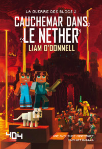
And right now, Liz is working on the cover for Nether Nightmare. I’ve seen the rough sketches and it’s going to be just as fantastic.
Getting a good cover takes time and costs a bit more, but at the end of the publishing day it’s totally worth it.
What do you think? Do you like the new cover illustration? Let me know in the comments below.